Why should you choose Rocksauce Studios? Long story short, you want it done right! When yo...

“In this article, we are going to be using Netflix software architecture design as a case study”
Netflix is no longer about discovery; it’s about the destination. When you’re in your Netflix account, it’s highlighting the types of films and shows you most likely logged in to see. I can’t even count how many of my friends subscribe to Netflix specifically so they can watch “The Office” or “Friends” (although both those shows will leave the streaming nervous in the not-so-distant future). The service is highlighting big budget, big name content; it isn’t helping you discover the niche auteur films and zany foreign tv shows.
So is this good software architecture design or bad design?
As the first streaming service, Netflix sold itself to users as an alternative means to watch their favorite content. If this is still why users come to Netflix, then the design is guiding the them quickly and easily to what they want: big budget, big name, popular content the moment you open the app. Good software design.
But if a user is looking to discovery something off-beat, something independent or less well known, this design doesn’t work. The only way to find something off the beaten path in Netflix is to search for it, but then, if you’re looking for new discoveries, how do you even know what to search for? Bad software architecture design.
Design is all about the user journey. Is it intuitive? Is it usable? Does it provide what the user needs? And even further: is the design customizable? Is it accessible to every user?
Here’s a great example of a parking sign in LA that is 1) clear, 2) intuitive, and 3) accessible.
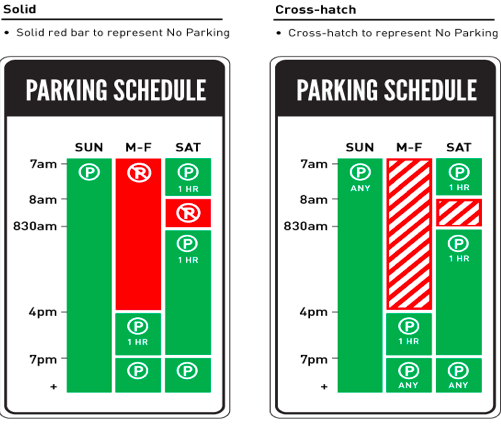
The design shows only the information a driver needs: can I park here or not? Plus the sign on the right includes stripes to make the signs accessible to color-blind drivers: stripes for “don’t park” and solid blocks for “okay to park”. (Read more about the software designer here).
I asked our team at Rocksauce to share some examples of software architecture design. Our Head of Ideation, John Gholson, was raring to go with this infuriating example from Google Calendar.
Whenever John tries to delete a recurring event in Google Calendar, this choice appears:

How incredibly unspecific. “This event” seems clear: the event John clicked on from one specific day. But what about “this and following events” and “all events”. Does it really mean all events? Or does it mean previous events, the current event, and forthcoming events with the same name?
After using it for years, we know its the latter, but to a new user, this is very confusing. What if you choose “all events” and delete absolutely everything on your calendar? You’re screwed. Good job, Google.
“Check out our software architecture design“
This question seems like a remnant from ages past when Google Calendar was just beginning, before they had the ability to customize. They could easily add the name, time, and location details of the event to this question so John knows exactly what he’s deleted when he clicks “OK.” But they didn’t. It seems they’ve spent so much time perfecting and updating the calendar itself that they likely glossed over this element.
It’s so easy to do that when designing. You can get siloed, so focused on what is in front of you that you forget to get feedback: from your peers and from users. And if you don’t get feedback as you go, then you’ve spent all your time and budget on a design that might do nothing to help the user.
Here is another design that John showed me that has users crying out for a solution. In the game “Outer Worlds”, whenever a player walks up to another player to introduce himself, he immediately and unintentionally pulls his weapon. What a nice greeting: Hi! Nice to meet you! Here’s a gun in the face.
Like that greeting, bad design is inconsiderate. User journey is what design is all about, and bad design stops the user in his tracks. A user can’t do what he wants to do without confusion or delay.
We’re more likely to notice bad design than good design, and that’s because, if the design is good, the user isn’t thinking about how to get where he needs to go (bad design), he is just focused on getting where he needs to go (good design).
So the next time you’re looking to design something, remember to think about the user journey. Avoid bad design by getting feedback: from your peers, from your users. Test the design, revise, and perfect. You’ll end up with a good software design that leads the user intuitively on their journey. That’s what we do here at Rocksauce, and if you’re ever looking for support to get the right design for your users, give us a call +1-866-981-6847 or drop us an email at [email protected]
So you want to build an app–congratulations! We’re big fans of apps, truly! Now to addre...